I use an old graphics program that I own. I don’t ‘rent’ it. I own it. It’s mine. It’s Paint Shop Pro 7. There are a lot of things I can do with it, but many of them would be easier with a newer program. I understand that, but I’m not renting a program. This post is about how I distress designs to get that vintage look.
I was at a store recently and saw a guy with a shirt that had one word in a ‘varsity’ style, but I couldn’t seen the full word because he was wearing a jacket. It didn’t look like a team name or school name – it looked like it said ‘chocolate’. I thought it would be cool to make a varsity style design that wasn’t for a sport. I wanted the varsity style font, definitely a tail [or swash – that long part that goes under the word] and a distressed look. I chose a font called Fenway and some swashes to go along. I made the word Library, then started distressing it.
To distress, I have a few distressed backgrounds. You can usually find free ones easily through a search and just decide how much distressing you want. You do need layers to distress the way I do.
With your design on one layer, copy the distressed image file you’ve choosen, then start a new layer, select all, and paste the distressed image into the selection. Use a colour selection tool and hit a colour in the the distressed image, then find your selection tool and modify it to ‘select similar’. See if that looks like too much. If it is, try again from using the colour selection tool. You want a small amount of distressed, so you don’t over do it.
Once you have a good amount, switch to the main design image and cut. Is that enough? If you need more, move the selected section around and cut here and there until it looks they way you want.
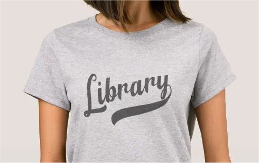
Here’s a close up:

That’s how the distressing works.
Might be easier if I wasn’t so set on owning a program, but not too hard.
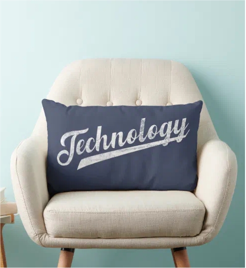
Other Random Varsity designs on Zazzle: